Posts

Business Cards

Image
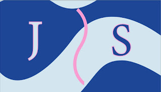
The artistic feeling behind each business card “theme” if you will, was inspired by different things in my life that I feel like can somehow represent me and the design can help me to stand out as an individual.   The first, blue and pink with curves, helps represent myself in a large part of my life. My personal logo is a ballerina due to spending most of my adolescence as a ballerina. The fluidity and softness of the curves throughout were to show a flow through the card as dance is something smooth and graceful, not jumpy and blocky. The colors were chosen because while pink is typically associated with ballet and dance and little girls, my favorite color is blue.     The second with the pink stripes, was inspired by the mid 2000’s Victoria’s Secret bag. One of my passions, hobbies, and favorite pastime activities is shopping and the pink stripes best represent a trip to the mall in my mind. I’ve also spent the last few months working on a public relations campaign for Victoria’s Se

Animation

Image
 Animation seems to be an incredibly daunting task. At the beginning of the semester learning I would have to complete an animation project made me want to immediately give up. Throughout the semester I continued to feel afraid of the assignment and eventually when beginning the project learned that it would be more tedious than scary.  When thinking of a scene to create I chose my cat, who has also been the inspiration of other artistic creations this semester. He was recently diagnosed with an illness he couldn't recover from and the day after I began the project he passed away. The animation assignment was really important to me because it depicts my sweet little angel in his natural habitat. After drawing several different cats, the dinosaur, masking several layers of different features in the animation I was finally able to assemble them all. The way I created was that I grouped each layer in order of movement for the frames and individually selected them and the movements for

Somewhere: Stars Hollow

Image
     The Somewhere assignment required an image of oneself to be photoshopped into another image. For this assignment I decided to edit myself into an image from the show Gilmore Girls. Although its incredibly outdated, I consider this to be a perfect show for fall. I'd have rather done a more interesting image in the diner or at a dinner with the grandparents, however, my photography skills, angling and lighting were inadequate.      When I found the group picture of the cast I knew it was perfect. There was a small open space between cast members and I knew that they had mostly already been photoshopped into the image already making it perfect. I threw on a simple outfit that looked similar to Rory's outfit and built a tower out of random things to take a picture in my room in hopes it would work once photoshopped in.       After masking myself in the image and completely editing myself in, there was a massive struggle with the angle of the lighting. I went back to square one

Furnando: In Color

Image
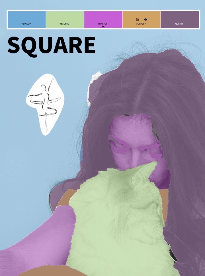
In order to complete a recent assignment, recoloring an image where you connect to another or the world around you, I used an image of my cat and I. Immediately he was in my mind to use to exemplify a connection to anyone in the world. Throughout the creation of the artwork I was unsure of the color and the proper placement for the colors. I eventually decided on the ones chosen based on the different color combinations in the color wheel of triad, square, and analogous. Each color combination ended up including relatively similar shades, as I followed my favorite colors. When coloring the different sections of the image I intended to keep similar shades away from themselves to maximize contrast throughout. Choosing cooler, bright colors properly exemplifies the spirits of my little angel Furnando and I thought it worked well together. The light and bright shades helped to lighten the spirits of a picture in a not so light time of our lives.

Photoshop Images

Image
1. I believe this image would be incredibly difficult for a beginner such as myself to recreate and photoshop my face into the image. Not only do you have to take into consideration the lighting and amount of grain, but the positioning and shadow. This is of course something that could be done with immense attention to detail, but to realistically recreate the positioning would be difficult. 2. This image has helped to inspire my "Somewhere" project, as i will be similarly positioned in mine. I decided I'll be pasting myself into a cast photograph of a TV show Gilmore Girls. If you look closely, the image is already photoshopped to include the cast members all together. This image is a great example and similar idea to my project. 3. Not only is this a funny picture, it's also pretty realistic. It truly looks like his hair could be that way and that he's holding the little binder. I'm not sure what the man giving the request was expecting (obviously not to be

Tag Brush

Image
Creating a signature for my creations had to include something relative to myself without directly writing my name. The logo and tag brush I created were to represent my personal history as a dancer. A majority of my childhood was spent in a dance studio, therefore the representing logo is a ballerina.  Using layerings of different shapes, textures and shading I was able to create a unique tag brush to use in different pieces I create in and for the class. Unfortunately it did not save in my computer so I am currently in the process of recreating it. Compiling a work of art with the tag brush and using few effects was quite simple. Starting with a textured and layered background I found it best to create several layers of different sizes and colors to add depth rather than a solid background. I wanted there to be a central concentration of the tag brush and continued to layer and frame the center with smaller and different colored stamps.  Finally, I chose the colors: red, black, and w

Photography

Image
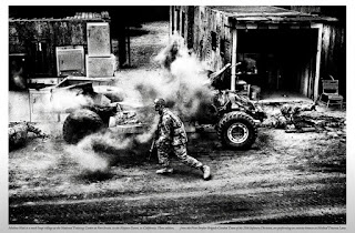
The embedding of photography into the U.S. Military was very moving because it gives such an in depth, up close look at what goes on to those who don't witness it first hand. The way that the photo is shown in black and white, simplifies it so the viewer isn't looking at color its more of a view of the action occurring. Seeing the grain captures the effect of the act, fighting is dirty it shouldn't be a clean and clear image its a messy action and is beautifully depicted. The way that Platon is able to photograph actions and individuals in a way that captures their essence using different focuses and perspectives is noticeable in his images. Within different scenarios Platon impressively connects and displays each in a way conducive to that individual subject or individual to tell a story to the viewer. this is an image of me interacting with my cat, it may not be observable but we have an extremely close connection and always have. I chose Furnando as a perfect subject to