Posts

Showing posts from October, 2023

Photography

Image
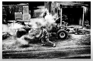
The embedding of photography into the U.S. Military was very moving because it gives such an in depth, up close look at what goes on to those who don't witness it first hand. The way that the photo is shown in black and white, simplifies it so the viewer isn't looking at color its more of a view of the action occurring. Seeing the grain captures the effect of the act, fighting is dirty it shouldn't be a clean and clear image its a messy action and is beautifully depicted. The way that Platon is able to photograph actions and individuals in a way that captures their essence using different focuses and perspectives is noticeable in his images. Within different scenarios Platon impressively connects and displays each in a way conducive to that individual subject or individual to tell a story to the viewer. this is an image of me interacting with my cat, it may not be observable but we have an extremely close connection and always have. I chose Furnando as a perfect subject to ...

Propaganda Poster

Image
     A piece of propaganda including myself I thought to include something currently relevant and important in the country. When looking through examples of propaganda posters the ones that caught my eye were those about speech and involving the government, particularly those including a hand covering the mouth of the main subject. I found this to be a significant image and pose to represent being silenced.      Rather than taking a new picture for the assignment I used a photo from the fourth of July in a USA hat and used images of hands in order to cover my mouth and take away the hat. These were representative of being silenced and where exactly I was being silenced. Finally I added in prison bars to show I was not free.       Using layering and arrangement I decided to put the prison bars over myself but the words "FREE SPEECH" as well to include them in the confinement I myself was in. I used different shapes and shades as well as l...

Self-brand Logo

Image
  When beginning my work to create a logo that accurately represents myself in some way I started off with my initials, things I like, and my nickname. I ended up choosing the dancer because of its elegance and the strong influence it had on my life growing up. From ages three to 14 I spent the entire year in ballet classes. Ultimately, I believe this has shaped my personality, well being, and overall the way I am. I can imagine the simple design as a watermark or logo on future works of art or for self branding. Initially I wanted to just make a light pink dancer, it accurately goes with the symbol if you look at the general colors in ballet, but the logo needed a more important meaning. Green is a natural earthy color. It can represent new beginnings and growth, as well as renewal and abundance. Gray is clean and formal but lighter and less intense than black. Since gray is a lighter shade of black it remains sophisticated and can pair well with most other colors. Blue is a color...